Part 1: Summary of Readings
There are three stages to pre-production within animation, that being concept development, previsualization, and asset building. If you are animating for a pre-existing company or for somebody in general, odds are you will be getting a creative brief at the beginning of your process, which is a document that establishes the client’s aims and objectives, target audience, and deadlines. The most important questions you can ask yourself during the early stages of creation of your project is what must it be, who is it for, what is your objective, and when is it due. Some exercises that can be utilized in order to be able to get your plot and purpose more solidified include The Elevator Pitch, The Six Word Story, and The Tagline. The Elevator Pitch challenges you to summarize your project in a sentence, a sentence which establishes the plot, tone, and the theme of the project.The Six Word Story is quite self-explanatory, where it challenges to describe your project in six words.. Finally, The Tagline encourages you to create a catchphrase or slogan that could be utilized to persuade someone to watch your project. Style frames are also introduced, which are a single image that presents the overall look and feel of the piece.
Part 2: Inspiration


GIF 1: This GIF is from the video game Baldur’s Gate 3, and showcases a drow playing a violin or fiddle. While this one isn’t as smooth as a lot of the others I presented, given how many effects and movements are in it, I think it still flows relatively smoothly
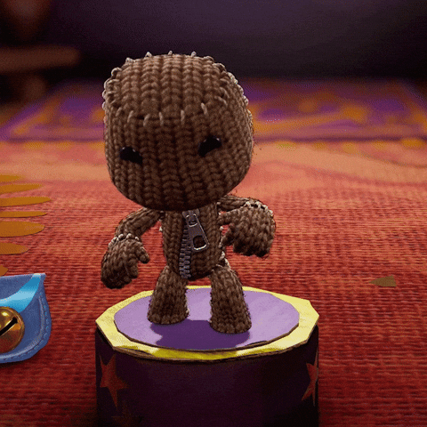
GIF 2: This GIF is of Sackboy from the game series LittleBigPlanet. The reason I picked this one is due to the smoothness of movement, and also how high quality the image itself is. It looks really sharp and high def.
GIF 3: This GIF is of singer/songwriter Olivia Rodrigo dancing. This GIF was selected due to the smoothness of movement
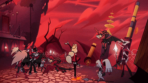
GIF 4: This GIF is from the television series Hazbin Hotel, and is of Charlie Morningstar’s transformation, made by Amazon Prime Video. This GIF was selected due to the smoothness at which it moves, and the quality of the images utilized.
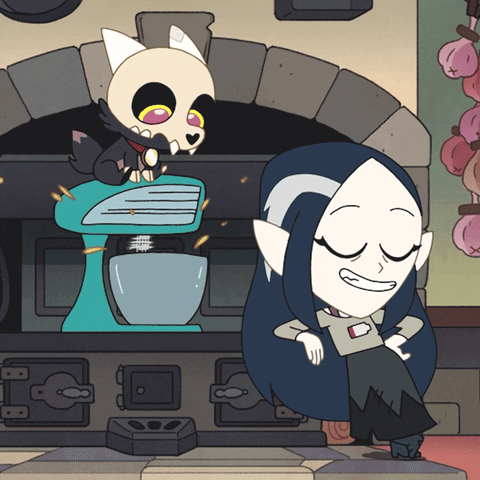
GIF 5: This GIF is of Lilith Clawthorne and King from The Owl House mixing batter in a mixing bowl with a blender that was made as a promotional piece by Disney Channel. This GIF was selected due to it seeming to smoothly go in between loop cycles, to the point that it’s difficult to tell one one loop ends and the other begins. I find that quite impressive to pull off with a GIF.
GIF 6: The following GIF is of Sypha Belnades from the animated series Castlevania, and has been selected due to, like the GIF before it, the ability to have the loops flow into one another so smoothly, that it’s difficult to tell where one starts and one ends.
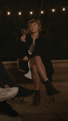
GIF 7: The following GIF is of Taylor Swift from the special Folklore: The Long Pond Studio Sessions. This GIF was selected due to the image quality and the smoothness of movement
GIF 8: The following GIF is the second of a collection of GIFs made by Disney Channel in promotion of The Owl House where Lilith Clawthorne is shaking a powder that seems to be poisonous into a pie crust. Same as the one that came before it, it was chosen due to the smoothness of transition between loops
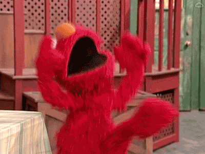
GIF 9: This GIF is of Elmo from Sesame Street celebrating while sitting down. This GIF was selected due to the smoothness of motion as well as in-between loops.
Part 3: Create
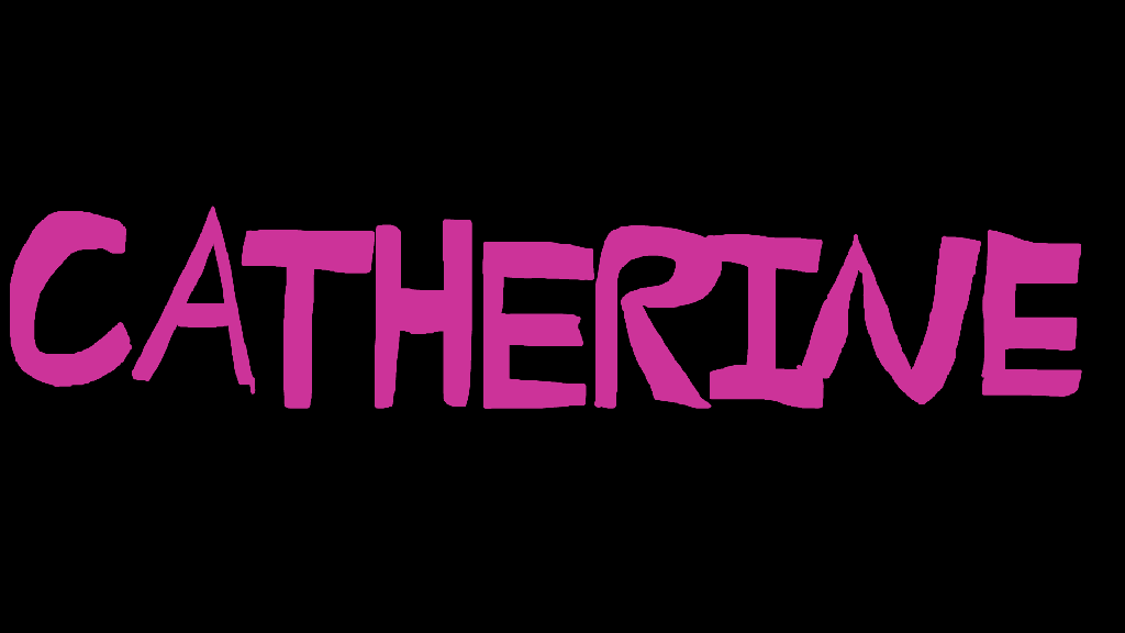
GIF #1: Onion-Skinning
I was quite proud of this to say the least. I would’ve tried to make it at sixty frames per second, but given the amount of frames I utilized it probably would’ve been too short (It was 119 frames, which in 30fps makes it just under 4 seconds long, but if I did it at 60fps, it would be less than 2). I admittedly was having a creative slump when trying to figure out what to make, so I eventually just went with my name and decided that this could be utilized as almost a virtual name-tag of sorts. Initially it was going to be just the letters moving up and down, but I found that if I animated the letters to go all the way up the frame and all the way down, it would’ve take way too many frames than what was asked for. So I decided to only have it move up and partially down, than the rest of the suspended letters would just hop back to their place in one frame. It ended up being too short though, so I needed to add something else, so I came up with the idea of the curly teal underline, which ended up becoming my favorite part. I think it came out really well and adds some more interesting movement to the GIF. It also adds some nice contrast of color to the pink. Finally, initially, this GIF was going to have a white background, but as I was prepping for export, Adobe Animate gave me the option to switch it to black if I wanted to. I did so, and absolutely loved the results, due to how much it made the colors stand out. All in all, this was a very enjoyable piece to make, and I think it turned out nice visually even though I was limited to drawing with a mouse.
GIF #2: Pre-Existing Image GIF

At the time I came up with the idea for this GIF, I was having a bit of a depressive episode. Sometimes I struggle to put my emotions into words, or due to one reason or another, in general let the emotions out and somewhat purge them from my body. One of the things that I find though that helps is when I consume media that resonates with the emotions and struggles I’m facing. Two creatives that I feel like whose work resonates with me a ton is Mary Lambert and Roxane Gay (who I met in high school). When I came up with this idea I was reading and listening to Lambert’s poetry book Shame Is An Ocean I Swim Across and was looking up quotes from Gay’s book Hunger: A Memoir of (My) Body. I was originally gonna do a quote from one of the works, but I felt like that would look bad, so I did a shorter phrase. In regards to technique, I initially was going to have the letters appear frame by frame, but I wanted to give the GIF a more jumpy, kitschy feel, so I had the letters appear every 5 frames instead to give a slight gap of time in between the letters appearing. I also found Adobe Stock transparent images of letters that were of different styles and colors to give it more of a scrapbook-esque feel. This was made in Adobe Animate as well, but I did use Photoshop to remove the backgrounds of the images of Gay (top right) and Lambert (bottom left).
GIF #3:
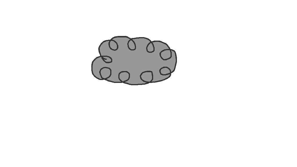
For the final GIF I made, I decided to go back to onion skinning, finding that to be more fulfilling to create and comes out with a smoother result, which I find more rewarding to watch. Given at the time I was making this there was a bad rain/snow storm happening, I thought it would be a good idea to make a cloud with rain drops, lightning, and a caption saying, “CRASH!” shortly after the lightning disappeared. I remember hearing somewhere that the amount of seconds it takes for thunder to sound after lightning is how many miles away the lightning strike is coming from. So I tried to give a gap between when the lightning disappears and when the, “CRASH!” caption appears in order to portray that. I also was thinking about coloring the raindrops in, but decided against it since raindrops usually are clear if all is well in the atmosphere. So I just did the outline so to just give indication of where the raindrops would be. I also decided to stagger the raindrops falling so it looks a little more natural, alternating which of the raindrops moved by frame


Leave a comment